Design Considerations
Contents
Design refers here to the substantial process of both content planning and visual design. Readers of this manual who are familiar with the data that will populate the dashboard, will most likely be more concerned and more skilled in the content planning phase. For the sake of completeness, this chapter will also cover some principles of visual design and some considerations regarding dashboard design specifically. However, for all projects but especially complex projects and public-facing dashboards, it is highly recommended to enlist the help of a web designer, for example from the communication department of your institute.
This section is not meant to be exhaustive, but rather an introduction and guide to the process of dashboard design.
Content Planning
The content planning phase is crucial to create a good product that will fulfil its purpose and properly meet the needs of the user. Going through this phase meticulously will give clarity for the upcoming development, allow scalability and flexibility, and save time and resources in the long run.
The steps involved in this phase are to (1) define in detail what your product will be, (2) identify the profile of the intended user(s) and (3) design the content flow and layout of your dashboard.
Know your product
Content planning begins with clearly identifying the nature, aim, scope and limitations of your product.
For further information, please see “Planning the dashboard” in the step-by-step guide of this Information Centre.
The following worksheet can help you and your team conduct a content planning workshop to define the characteristics of your product.
Know your users
Identifying the problems, needs and expectations of the users is the key to building a successful and useful product. It would be unwise to develop the exact same dashboard for a small set of experts and for the general public. Likewise, you, as for instance a scientist developing a dashboard, have a different level of knowledge and familiarity with the content of the dashboard than the intended user. Doing detailed user profiling will help to craft a platform fully targeted to the needs of the users.
User profiling is a process where you create a fictional user persona for each distinct group of target users. This set of user personas acts as a simplified representation of your user base, with characteristics, limitations, and expectations that are similar to those of your users. This concretises the plurality of the user base into a simple model of needs and limitations, which should guide the design choices and help craft a more user-friendly platform.
TODO: Add example of user personas from presentation
TODO: downloadable worksheet for user profiling process
Layout design
With the insight gained from product definition and user profiling, it is now possible to start organising content in a meaningful way.
Global Page Layout
In this step, you decide which basic website elements (logo, menu, footer, …) will be present, and where to display them on the page. This will be in parts dependent on the technical solution you have chosen to develop the dashboard, and how much flexibility it allows.
In general, do not try to reinvent the wheel. Most people are familiar with the internet and have a set of expectations when it comes to navigating a website (see Jakob’s Law). Deviating from these expectations will only make your dashboard harder to use.
Basic web elements which are expected to be found include the following:
- Logo and website name – Top of the page. Centred or in the left corner
- Main navigation menu – Top of the page. Below or to the right of the logo. Alternatively in a sidebar to the left of the page.
- Main content – Occupies most of the screen. Traditionally will be linear content on a scrollable long page, with fixed width and centred on the screen. Alternatively, dashboards can be presented as tiled blocks of content on a grid that takes the whole screen.
- Footer – Optional but very useful. A band occupying the whole bottom section of a page. Usually contains:
- Logo and name of the page
- Copyright with date of activity and name of the developer/page owner/institute
- Main navigation links
- Contact information
- Legal information, logos and links to partner institutions, links to employees only sections, etc (optional)
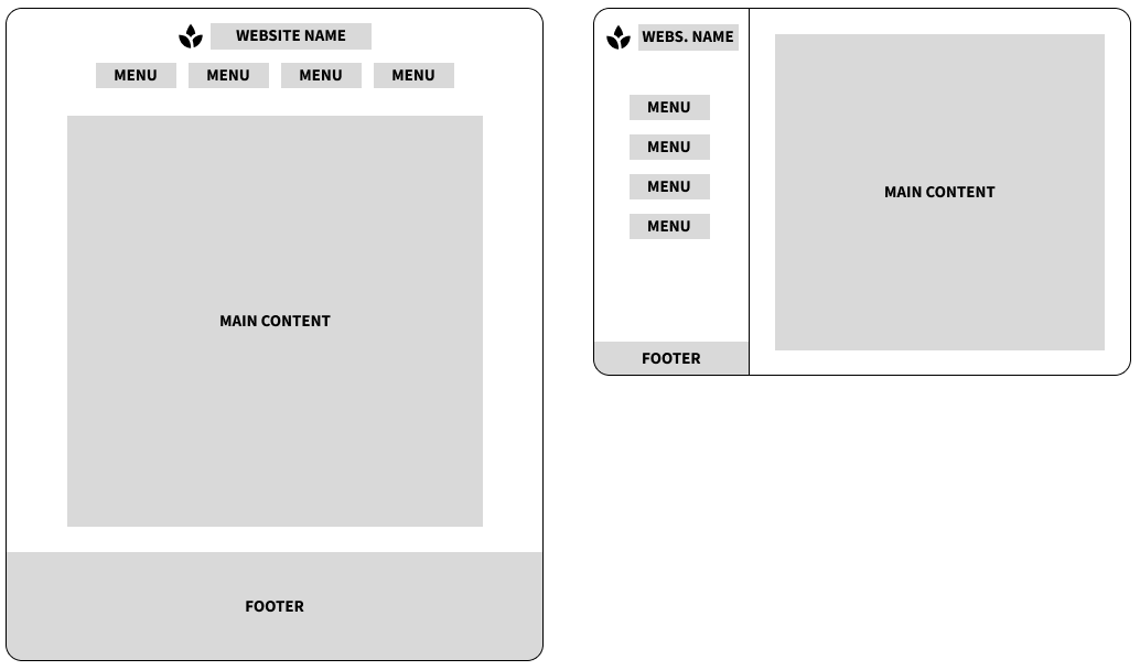
Example of two different page layouts. Left: Centered aligned linear content. Right: Layout with sidebar.
Content Structure
In this step you start deciding on the content (text, maps, graphs, interactive input fields, downloadable elements, …) that your dashboard will contain, and how to structure this content. The user research done previously should greatly inform the decisions you take here.
The goal is to divide and organise the information in meaningful blocks and create a natural flow of content that guides the user to the information they need. Based on the product definition and the overview of your users’ needs, you can decide which content is needed, how to structure it and in which order it should be introduced. Will you have tabs and subtabs? What graphs or visualisations will you have? Are they interactive? What text is needed to accompany the data?
Start designing at a global level and dive into details iteratively. At each step, the content should flow in a meaningful way, before you delve deeper into specifics.
Wireframing
Wireframing is a common web design tool to plan the structure of content. It is a process where one draws boxes and lines to represent content blocks. It is usually done with pen and paper. At this stage, the goal is to put ideas on paper freely, and quickly iterate over several ideas and options. There exist some wireframing softwares, but considering their learning curve and slowness of use, analouge tools will always present less of a barrier. These digital tools can be useful later on, to produce a clean version of the wireframes to share with colleagues and stakeholders.
Wireframing allows you to think of the nature of the content and the flow of information, without getting distracted by the wording of a text, the colours and styles of a graph, or any other details. This technique allows you to refine the flow of content and make sure that the information is properly introduced, that the most important information is given a choice location on the page, and that the user would be able to go through an action and achieve their goal in the most efficient way.
This technique should be used in the initial stage of page layout and content structuring, but can also be used later on for more detailed elements (e.g., a complex block of content with a graph, a legend, a figure caption, a user input field with a text field and dropdown menus and a final download button).
TODO: Things to keep in mind while doing wireframing
Visual Design
Visual design is deciding how the information is being presented. It is done through for instance page layout, colour palette, font choices, illustration, and graphic design. It relies on various principles such as hierarchy, contrast or repetition, which are known to influence how the eye identifies and understands visual elements and patterns. It is a very important part of the dashboard design process. A good UI (User interface) is essential to craft a good UX (User experience) and will allow the user to reach information more efficiently.
It does require skills and knowledge that most would not be experts in. Ideally, you will have the support of an experienced designer in your team or from the Communications Department of your institute. This subsection is only aiming to give some guidelines and pointers to learn further on these topics.
Some basic qualities of a good design are that it is accessible (the information is reachable and understandable), and that it is visually pleasing (it is comfortable and/or interesting to use the platform).
Accessibility
When creating website, you should always make sure that your product is accessible. Accessibility requirements are extremely important (and sometimes required by law), especially for dashboards open to the public. The Communication Department of your institute will have rules and resources to make sure you are providing a platform accessible to all. These are some things to keep in mind:
- Colour palettes should be accessible to colourblind and other visually impaired people. That means having colour being contrasted enough on their background, never using a red/green dichotomy for graphs, and relying on symbols more than colours to convey information if possible.
- All important features should be keyboard accessible.
- The text and semantic of your page should be screen-reader friendly. That means using HTML tags in a semantically correct way, and always providing ALT text to images.
This is especially important if you are developing your own custom code with basic HTML/CSS/JS. But note that some dashboard-making solutions are still lagging behind on some aspects (e.g., some input fields in R shiny are not yet keyboard accessible, but upcoming versions should fix this). You need to do a concerted effort to go through all aspects of your website and make sure that you are as accessible as possible.
More information on web accessibility:
- W3 Web Accessibility Inititative - extensive resources, standards and guidelines
- Mozilla developer’s tutorials on accessibility - very pedagogic and understandable learning material
Principles of Visual Design
Principles of visual design include tools such as emphasis, contrast, similarity, repetition, and alignment. There appears to be as many lists of these principles as there are designers, with varying numbers, nomenclature and definition. A designer uses these tools to craft a specific experience for the viewer, by putting focus on specific elements, directing the eye along a specific path, and increasing visual interest and appeal. There are many wrong ways to do it, and no single right way, which is why the input of an experienced designer will always be beneficial.
If you do not feel confident in this task, the safest option is always to keep things simple. If you have a solid content structure from the previous step, that can be enough. Most development tools will output a product with a decent default UI which can be sufficient. Custom visual design will help creating a better product, but it is not strictly necessary.
Here are some ways these principles can be used to craft a better UI and UX:
- Hierarchy: having a good visual hierarchy between different elements will help the user understand the structure of the website better (having title, headers and subheaders with varying degrees of emphasis), and reach the important information faster (using bold text for important sentences, but not overusing it).
- Unity or consistency: having a unified design system (a set of decisions regarding font type, font size, color, graphic style) throughout the dashboard will help the user understand the structure of the content better (e.g., important takeaway messages will be displayed in bold italic). You don’t want to start introducing exceptions (e.g., an important sentence displayed in bold underline), and break the underlying patterns that the user has learned about your platform. Breaking such patterns will make it harder for the user to find and understand the information presented to them. It can be difficult to achieve if you are working collaboratively, or even alone along a longer time period. It is thus recommended to decide on a design system prior development, to avoid inconsistencies. You can also do a full redesign during development. Check the consistency in text colour and emphasis (bold/italic/underline), in spacing between paragraphs and around figures, in page structure for multi-tabs dashboards, in graph and map styles, and in the vocabulary used throughout the website
- White space or negative space: creating breathing room around elements will allow the user’s eye to land easier on different blocks of information and their mind to rest and refocus. It will help you show a clearer structure of content, and put emphasis on what is important. You can, for example, use margins around graphs, increase the line height of text, and increase the space between paragraphs.
If you are interested, you can find more information here:
- Short video on the Principles of Design
- Simple web browser or Youtube search for “Fundamentals of web design”, “Principles of visual design” or the like.
Tips for better dashboard design
Some miscellaneous tips to improving the UI or UX of your dashboard:
- Involve your Communications Department early in the process!
- Various UI features that will improve UX:
- Back to top button for long linear pages
- Spinning wheel on loading elements to show that something is happening and the user should just wait
- Conditional feedback message based on user interaction (e.g., a success message after downloading a file)
- Custom explicit error messages for all situations (url invalid, database failed to load, user input invalid…)
- Breadcrumbs to help navigation in complex dashboards (e.g., One Health > Projects > MATRIX > WP6)